Device based website with Rails

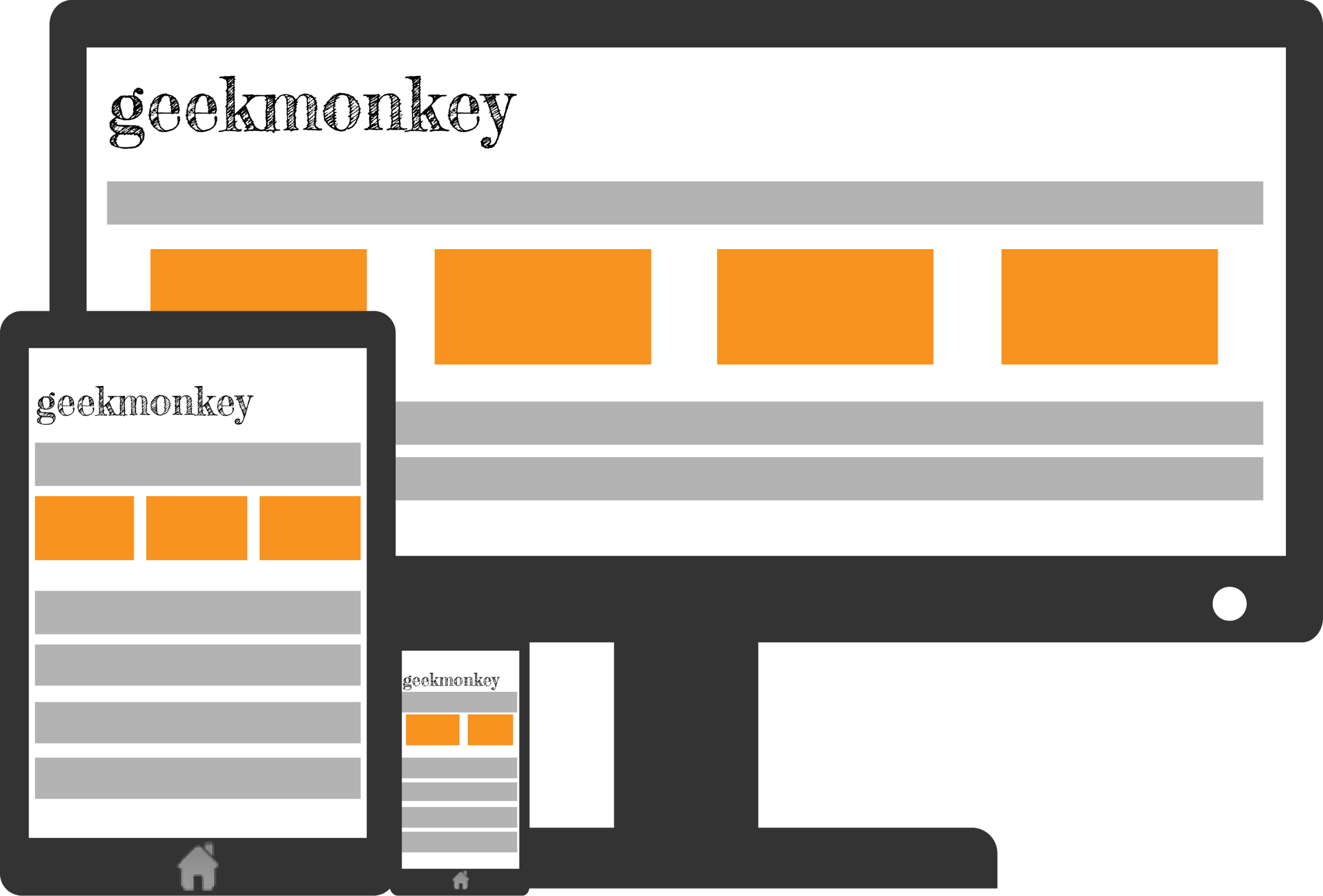
In recent years the multiplicity of devices connected to the internet has increased dramatically. In todays world people do not only surf the web on their desktop computer, there are smartphones, tablets and even TVs connected to the web. All those devices come with different screen resolutions and capabilities in rendering your website. Tablets can be rotated by 90 degrees and suddenly a previously wide screen turns into a narrow screen with limited space for your website.
CSS3 Media Queries
CSS3 introduced so-called media queries that allow a web designer to build responsive web designs. The idea is to apply a different set of CSS styles to a layout depending on the screen resolution, orientation or device type.
@media all and (orientation:portrait) { … }
@media all and (orientation:landscape) { … }
The above snippet applies CSS styles based on the orientation of the device (e.g. tablets can quickly switch between those two modes). The W3C Media Query specification describes how the orientation feature works:
The ‘orientation’ media feature is ‘portrait’ when the value of the ‘height’ media feature is greater than or equal to the value of the ‘width’ media feature. Otherwise ‘orientation’ is ‘landscape’.
Media queries come in very handy to make your website look good on a variety of modern devices. If you like, try to resize this website and see how it changes when your browser window gets narrower.
Mobvious
CSS3 media queries are very powerful when it comes to changing the look of your website depending on the features of a certain device, but what about the content? For obvious reasons CSS cannot change the content served by your web application. Small devices, especially smartphones and tablets are usually connected to the internet via 3G/LTE and therefore have limited bandwidth or traffic. You might not want to send HD videos or High-res pictures to those devices and instead automatically provide downscaled versions of your media. For that you need server-side device detection and that is where 'Mobvious' comes in.
Mobvious is a Rack-based device detection ruby gem that uses the User-Agent of the browser to detect the device type (alternatively you can use URL based device detection). As Rails is built on top of Rack it can easily be used in Rails. The downside of the User-Agent approach is that the detection will only work if the browser sends the correct User-Agent to the server.
Installation
To install mobvious you have to add it to your Gemfile first and then run the 'bundle' command.
gem 'mobvious'
Mobvious runs as Rack middleware and must be added as such in the application.rb:
config.middleware.use Mobvious::Manager
Finally, you need to create an initializer to tell Mobvious what detection strategy you want to use. Mobvious comes with three strategies that can be combined. As mentioned before, there is a User-Agent based detection strategy, alternatively you can use URL based detection or detection based on a cookie.
Mobvious.configure do |config|
  config.strategies = [ Mobvious::Strategies::MobileESP.new(:mobile_tablet_desktop) ]
end
The setting we use here will differentiate between mobile devices, tablets and desktop computers. For more details have a look at the documentation.
Rails
After a restart of your application mobvious will set the device type in the request.env['mobvious.device_type'] environment variable. There is a gem called mobvious-rails which adds several helper functions to Rails to make working with mobvious easier. The mobvious-rails gem is very simple and instead of adding another dependency to your Rails app I suggest to just build the helpers you need yourself:
helper_method :device_type
def device_type
    request.env['mobvious.device_type']
end
From now on you can use this helper method to adaptively change the content of your website. You can, e.g. use it to serve medium resolution images if the user is on a mobile device:
[...]
<% if device_type == :desktop %>
  <%= image_tag image.file.url(:normal), article_path %>
<% else %>
  <%= image_tag image.file.url(:medium), article_path %>
<% end %>
[...]
With our configuration, the Rack environment variable can contain three values: :desktop, :mobile and :tablet. Again, check the documentation of the mobvious gem in case you need a more specific setup.